PeopleTools Gems to Level-Up Navigation, UX, and Productivity
-
Posted by Quest Editor
- Last updated 12/08/25
- Share
![]()
PeopleTools Gems to Level-Up Navigation, UX, and Productivity
A RECONNECT Session with Gideon Taylor
PeopleSoft is packed with functionality, but if users can’t find what they need quickly or feel overwhelmed by screens and notifications, productivity suffers. In their RECONNECT Spotlight Session, Gideon Taylor’s Alisha Malcarne and Chuck Richey showed how to use PeopleTools UX “gems” to simplify navigation, surface the right data, and make PeopleSoft feel modern and intuitive for every type of user.
Why UX Is Now a Productivity Conversation
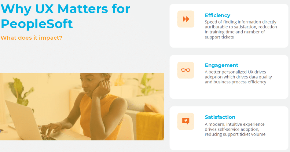
Chuck opened by framing user experience as a business issue, not just a design nice-to-have. Better UX in PeopleSoft translates directly to:
- Less time hunting for information
- Fewer help desk calls and tickets
- More consistent, accurate completion of tasks
You can’t measure “happiness” on a dashboard, but you can measure time. Chuck shared a simple thought experiment: in a 35,000-employee organization with an average salary of $70K, saving a single hour per person per week through better UX could translate to tens of millions of dollars in value. Even if you’re not cutting headcount, that time can shift to higher-value work.
The takeaway: PeopleTools UX and productivity belong in the same conversation.
What the Research Confirms
Alisha then anchored that point with industry research:
- Users struggle with complex navigation and want task-based workflows rather than generic menus.
- ERP systems create information overload, especially when users only need a small slice of the system.
- Finance and HR teams spend a huge percentage of time just navigating and collecting data instead of analyzing and acting.
All of it points toward the same mandate: simplify the path to action. And that’s where Gideon Taylor spends much of its time with clients—using delivered tools to refocus UX on real users and real tasks.
Two Underserved Personas in PeopleSoft
From project to project, Gideon Taylor sees two groups that most often struggle with PeopleSoft:
- Casual / Self-Service Users
- Log in infrequently
- Expect consumer-grade simplicity
- Need obvious “start here” entry points and guided workflows
- Admin / Processor Users
- Live in the system daily
- Use many components, queries, and reports
- Are often overwhelmed because they see everything
Most organizations have made some effort to tidy up the casual user experience. The surprise is how often admin users—who drive critical back-office work—are left to fend for themselves in a maze of menus.
Start with Personas, Not Pages
Before turning knobs in PeopleTools, Alisha urged teams to step back and define personas:
- Who are your core user types (self-service employees, managers, benefits specialists, payroll admins, etc.)?
- What components do they access most often?
- Which queries, reports, and transactions drive their daily work?
- What action items must be front and center?
The point is to design the experience around how people actually work, then choose the tools—homepages, tiles, search, work centers, landing pages, notifications—that best support that design.
Meet John: A Benefits Specialist Who Needs a Better Day
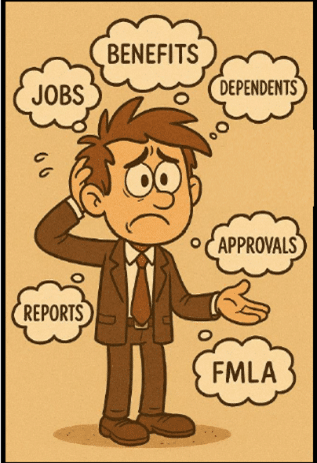
To illustrate, Alisha introduced “John,” a fictional benefits processor:
- His desk is covered with sticky notes and reports.
- His inbox is overflowing.
- He spends too much time chasing information and not enough time helping employees. 
John doesn’t need more menus. He needs a single place to work that shows:
- What needs his attention today
- Key metrics (like dependents aging out of coverage)
- Quick links to the components he uses every day
The rest of the first half of the session focused on how PeopleTools UX gems can create that experience.
Smarter Navigation: Beyond Menus and Favorites
Traditional menu navigation forces users to memorize long paths and drill through multiple levels just to reach a single page. Favorites help, but they often become unmanageable, scrolling lists with cryptic labels.
Alisha highlighted better options using delivered PeopleTools:
- Homepages to bring work to the user, instead of sending the user into the menu
- Global Search to locate pages, people, records, and even transactions in seconds
- Task-based tiles that represent actions (“Review FMLA cases”) rather than generic components
- Work centers and landing pages as role-based hubs
Her simple challenge: if you’re still relying mostly on menus, it’s time to make search and homepages first-class citizens in your UX.
Persona-Based Homepages: A Custom Work Center for Each Role
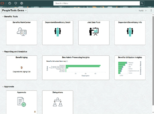
Alisha then showed a homepage built specifically for John, the benefits specialist. Tiles were grouped into sections that mirror how he thinks about his work:
- Tools he uses every day
- Reporting and analytics he checks regularly
- Approvals and tasks he needs to clear
- Insight tiles that surface “what’s happening” without running a report
Recent enhancements to homepage sections let you visually group tiles into logical bands—benefits tools, approvals, analytics, etc.—so a homepage effectively becomes a lightweight, role-specific work center.
When John signs in, everything on screen relates to his job, not the entire HCM suite.
Turning Tiles into Live Action Indicators
Tiles don’t have to be just pretty buttons.
Alisha showed a simple but powerful example built with a PeopleSoft query: a tile that displays the number of dependents who will age out of coverage (turning 26) in the next 30 days. When John logs in, he sees a count like “9 dependents aging out” and can click through to the detailed list.
That pattern – live tiles + drillable data -can apply to:
- Pending terminations or hires
- Open cases or tickets
- Items awaiting approval
- Exceptions that require review
A few design tips from the session:
- Make tile titles persona-friendly (“Expiring Dependents” vs. a technical page name).
- Use consistent icon patterns (e.g., multiple-person icons for manager actions, single-person icons for employee tasks).
- Make sure tiles with charts or numbers are large enough to be readable at a glance.
Insights: From Pretty Charts to Actionable Tools
Many organizations turn on Insights but only use them as high-level dashboards for managers. Alisha encouraged teams to rethink that:
Insights can and should be actionable for everyday processors, not just executives.
In the client example she shared (using Gideon Taylor eForms data):
- A tile shows counts of expense forms by status (saved, pending, approved).
- Clicking on a chart segment filters a list of forms below.
- From that list, users can view or act on those items—approve, follow up, send notifications, etc.
The pattern is simple and powerful:
- Build an insight that surfaces the queue or condition a persona cares about.
- Let users drill into that subset.
- Provide actions directly from the drill-down page.
For each persona, ask: What should they see first thing when they sign in? And what can they do from there without exporting to Excel?
Notification Composer: Powerful, But Use with Care
Notifications are another crucial UX element—used well, they keep people on track. Used poorly, they become background noise.
Alisha called out these key points:
- Worklists are fading; most organizations now lean on emails, texts, and in-app notifications.
- Notification Composer gives you one place to manage triggers, templates, and delivery methods.
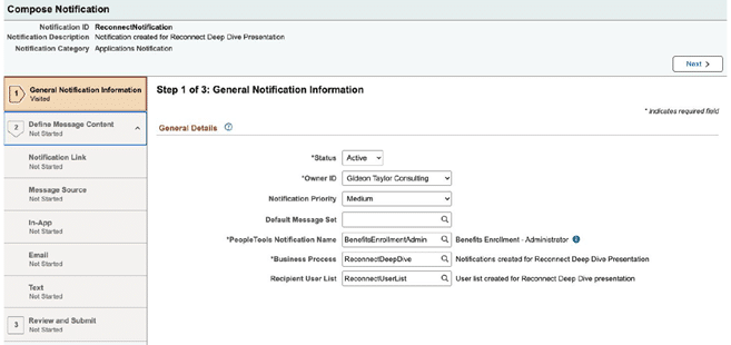
- The real challenge is strategy, not tools.
Questions she encouraged teams to ask:
- When should we notify? Only when something genuinely requires attention or action.
- How should we notify? Email, in-app, SMS, or a combination—and can the user personalize that?
For example, a leave administrator might need an in-app alert when an FMLA end date changes. That’s more actionable than adding yet another email to an already overloaded inbox.
Notification Composer also supports personalization, allowing certain personas to decide how they want to be notified. That flexibility will only become more important as organizations refine their UX patterns.
Taking UX Up a Notch with PeopleTools and Oracle JET
In the second half of the session, Chuck showcased projects where Gideon Taylor used delivered PeopleTools, search framework, and Oracle JET to deliver modern, streamlined experiences—without abandoning native tools.
Unified Navigation and Mega Menus
Chuck demonstrated a unified header with clear entry points like:
- Personal Information
- Income & Taxes
- Benefits & Retirement
- Accruals & Leaves
- “Hubs” for managers or transactors
Behind each, a mega menu groups related content and external resources, making it easier for users to see everything relevant to that theme in one place. It’s a simple but effective way to replace deep menu drilling with scan-and-click navigation.
Search-Driven Flows Using PeopleSoft Search Framework
Chuck then walked through a continuing education scenario where users browse and enroll in classes through an e-commerce-style search experience:
- Keyword search with sorting options
- Facets for narrowing by subject, college, start date, and more
- Advanced search for more precise filtering
All of this is powered by the PeopleSoft Search Framework and OpenSearch. Because Gideon Taylor built on the standard APIs, moving from Elasticsearch to OpenSearch was smooth and backward-compatible.
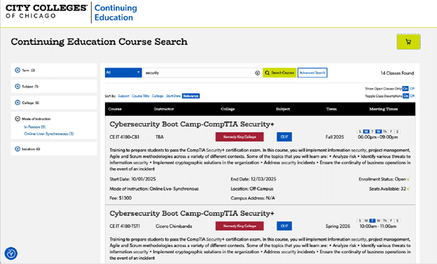
From search results, users see course details, schedules, and whether seats are available, and can add items to a cart.
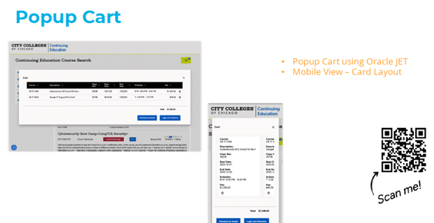
Modern Cart and Checkout with Oracle JET
The cart itself is built with Oracle JET, providing:
- Responsive layouts for mobile and desktop
- Accessible, modern components
- A card-style layout on phones to swipe through selected courses
From there, users can check out as guests or log in and complete the process, with Gideon Taylor’s eForms and PeopleTools logic handling admissions and enrollment behind the scenes.
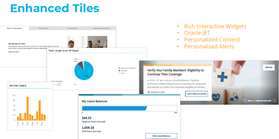
Enhanced Tiles and Widgets
Chuck closed by showing Oracle JET–powered tiles and widgets embedded into PeopleSoft:
- Rotating announcements and news tiles
- “At a glance” panels pulling live data via JSON
- Personalized alerts and dashboards aligned with the organization’s brand
All of it keeps content fresh and relevant, making PeopleSoft feel less like a legacy system and more like a modern web application—still entirely grounded in PeopleTools.
Where Gideon Taylor Fits In
The session wrapped with a reminder to attendees that Gideon Taylor works across industries—higher education, public sector, healthcare, and commercial—helping clients:
- Modernize PeopleSoft UX using delivered PeopleTools
- Replace paper and PDF forms with configurable, workflow-enabled eForms
- Leverage search, insights, and Oracle JET for richer, more intuitive experiences
If your PeopleSoft users are still asking, “Where do I go to do X?” or living in spreadsheets and sticky notes, the patterns from this session offer a practical roadmap. Start with personas, redesign navigation around tasks, turn insights into action, and apply notification strategy carefully. From there, partners like Gideon Taylor can help you take PeopleTools UX and productivity to the next level.
