Kibana Visualizations for Recruiters and Recruiting Administrators
-
Posted by Quest Editor
- Last updated 9/20/24
- Share

PeopleSoft HCM Strategy Product Management Director, Tammy Boyles, recently presented new Kibana visualizations that can keep the recruiter on track and the recruiting administrator in the know. During the presentation, Tammy covered updates that have not yet been delivered and are covered by the forward-looking, safe harbor statement.
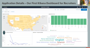
Previously Delivered Kibana Dashboard for Recruiters
Before getting into the new dashboards, Tammy displayed the first Kibana dashboard that was delivered for recruiters. You may have seen this dashboard previously. It was simple, using the elastic index that was available at the time, as a first look at and feel for Kibana visualizations.
New Recruiter & Recruiting Administrator Dashboards
The Recruiter Pipeline Dashboard is a new dashboard that enables the recruiter to:
- Evaluate your recruitment process via a dashboard with current and historical data
- Stay ahead of the process
- Find the bottleneck within your Hiring Team
- Quickly drill down to the Applicant or Job Opening
- Determine when to close the job opening or start re-advertising the job
- Easily see time to hire in averages and actuals
- Easily see ROI on Sourcing
- Find out why your applicants are declining offers
- Create predictive hiring for those hard to fill jobs
The Recruitment Administrator Dashboard empowers the recruitment administrator to:
- See Diversity Data
- Quickly drill down to the Applicant or Job Opening
- Evaluate your Recruiters’ Workload to stay ahead of issues
- Use the Recruitment Funnel to identify process bottlenecks
- Understand the Average Days to Hire by Recruiter
- Create predictive hiring for those hard to fill jobs
Recruiter Dashboard
In the old Kibana for recruiting, there were abilities to view locations of applicants, internal and external applicants by date, and drill down to applicant. Now, the team has taken this concept and improved upon it. There are 2 new indexes. Along with the previous index, these new indexes give you the ability to pull out much more data for visualizations. The Active Recruitment Pipeline is displayed below:
Filters affect your view, as shown below. First, no filters are applied:

After filtering to Job Family: Administrative Support and Application Type: Applied to a job opening, the numbers update appropriately:

Across the top of the screen is the pipeline. It’s the same information as Manage Job Openings, with the most important points in the recruitment process: Open Jobs, Applied, Interview, Offer, and Ready To Hire. If you would prefer to change these, you can create your own.

Next is the In Process Applications visualization:

From this visualization, you can drill down. You can go to the application and job opening.

If you’d like to look at Applications by Job Openings, you can either change the filter at the top or select the visualization titled Applications by Job Openings. Again, this gives you the ability to go to the application and/or the job opening.

Another new piece is the ability to look at applications by job posting. This is advantageous for those hard-to-fill jobs that you’d like to check up on. The new slider in Kibana allows you to look at the job openings with a specific range in number of applications. For example, if you’d like to view those with only zero to two applicants, move the slider appropriately, and the Posted Jobs List will show that information.

You can also slide the Days Since Job Posted to view jobs that have been posted for a significant number of days.

The slider feature of the Total Applications by Job Postings is great for answering manager questions such as, “How many job openings do we have with zero applicants?”
This dashboard is new, not yet delivered, and requires Tools 8.58.13 due to security.
The information explained above is based on active job openings. Regardless of the date range, these jobs are open—not filled, closed, or put on hold. The next visualization regards recruitment metrics, including both historical recruitment data and open jobs.
Recruitment Metrics
In Recruitment Metrics, filters can be applied in the same way as the Active Recruitment Pipeline to better understand a specific area of interest. Results will show from active and inactive recruitment.
In the slide below, the Veteran filter is applied to see how the organization is performing in the hiring of veterans.

Another new visualization displays the reason an offer is declined. As long as you add that information in while processing, you can view the data. In the example, two offers were declined. One was because of inadequate compensation and the other was due to a competitive job offer.

In the Recruiter Pipeline, the Days to Hire by Postings shows the number of days from Applied to Hired. You can also see the Average Days to Hire. Another exciting new visualization is Applications by Source. As you receive and apply the information from the applicant, you can see where your applications are actually coming from and which sources most effectively lead to a hire.

Applications by Region (Postal Codes) is a new map that gives you the ability to see how you can use geography other than State or Country to view the way people are applying. An example is shown below:

Recruiting Administrator Dashboard
The Recruitment Admin Dashboard is positioned for the administrator with diversity data. To avoid discrimination or being accused of discrimination, this information is not available to the recruiter. In addition to the filters offered on the Recruitment Dashboard, filters are available for Primary Recruiter, Veteran Status, Ethnic Group, Disability Status, and Gender, with drill-down abilities.

The following new visualization can help you identify characteristics of applicants over a specific time. In the example below, the data shows male, female, and unknown gender applicants over the course of 12 months with veteran status depicted by red stars. Some focus group individuals saw this as an advantageous visualization for recruitment regarding indigenous people in Canada, disability status, or other.

In Recruiter Workload, you can see information by recruiter. The slider option, as described earlier, is also available in Recruiter Workload.

Recruiter Data displays the recruiter funnel for analyzing how the recruiting process is performing. You can also see the Recruitment Funnel by Recruiters and Average Days to Hire. Focus groups were very excited about the Recruiter Data Funnel.


Kibana Visualizations Key Takeaways
With the new Kibana visualizations for recruiting, you’ll be able to evaluate your recruitment process with current and historical data. The recruiter will be able to see the process more clearly, and the recruiting administrator will stay informed on diversity data. It’s the art of the possible, as you apply each visualization in the way that best fits your organization. These visualizations are not delivered yet, so keep your eyes peeled for their release.
Leverage the Recruiter and Recruitment Administrator Kibana Dashboards to keep your recruiters on track and your recruiting administrator in the know.
